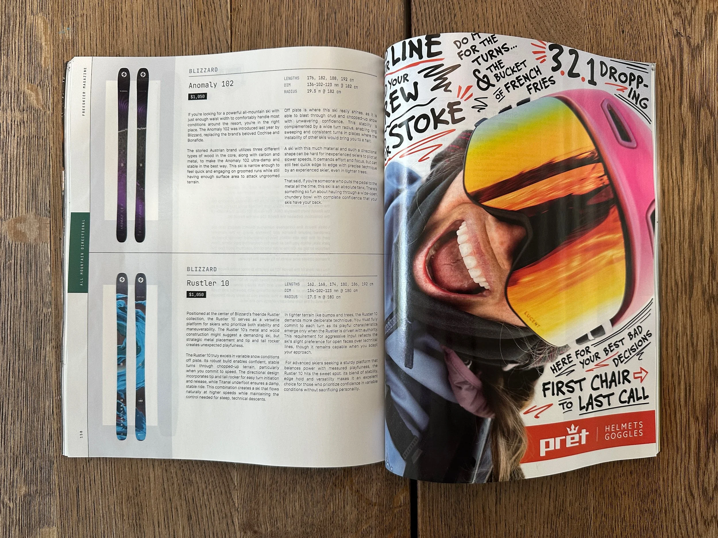
In the ski and snowboard helmet and goggle market, the creative can often feel, well, a little flat. It’s a category that struggles to break out of the "corporate" mold. But when you have a brand as inherently focused on performance, protection, and community as Pret , there's a huge opportunity to amplify that story and ignite deeper connections.
We have worked with Pret since 2022 on various projects. For the 25/26 season, we were able to get started early to transform their visual and messaging strategy. Our goal was clear: move beyond the reactive process of the past, and breathe vibrant stoke and personality into every touchpoint.
PRET’S Print Advertising Reimagined
The first major piece was the print ad campaign. In an industry where ads can look interchangeable, we went for an approach that was highly creative, authentic, and fun. We aimed to make the visual instantly arresting and deeply connected to the adventurous spirit of the skier or rider. The result was a design that felt expert yet approachable , standing out in ski and snowboard publications not just as an ad, but as a genuine piece of the culture. This print work served as the basecamp for the season’s entire visual language, proving you can be the best in the game while being the most interesting brand on the page.
The Beating Heart: Athlete-Driven Video
The true flow of the Pret brand is its athlete team. They are the unyielding force , the face of the brand in the real world, and the reason the community trusts Pret.
To bring the campaign’s visual identity to life, we focused on producing three short, punchy vertical brand videos. These weren't generic mountain montages. They were designed as quick-cut, high-impact visuals that:
Centered the Athletes: Showcasing their skill and passion, directly connecting the audience to the core community.
Delivered the Vibe: Capturing the fun, authentic, and sometimes gnarly reality of life on the snow.
Reinforced the Visuals: Using the graphic elements and tone established in the print breakthrough for absolute brand cohesion.
These videos are a primary conduit for Pret to build and deepen its connection with the ski and snowboard community, ensuring that when people think of Pret, they think of the incredible adventurers who wear it.
This project with Pret is a perfect example of Stay Gold operating as an extension of the client’s internal team , driving creative solutions that allow a brand to truly swing above its weight and maintain its position as an influential player in the industry.


